Ad-Astra
Ad-Astra is a web application developed by 4 developers, Deshay Clemons, Luke McDonald, Gabriel Undan, and myself. This application was a warmup to ensure our tech stack was ready to go for the upcoming Meteor Hackathon and HACC that will be taking duration in the Fall 2021 semester. This was a project to create a replicate of the LumiSight UH check in developed by DataHouse for the UH community. If we are looking at the layout and the basic functionality, my group and I were able to make an almost 1:1 copy of this.
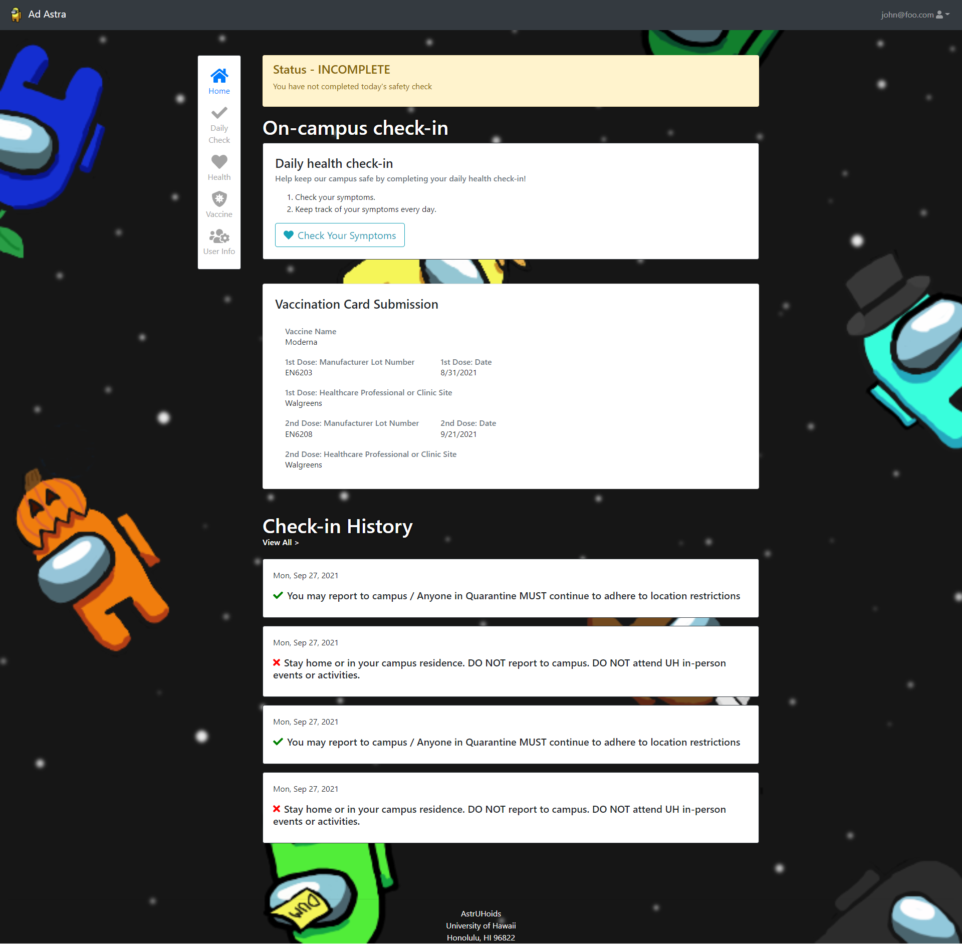
For this application, we used Meteor, ReactJS, React Bootstrap, MongoDB, and AWS S3. The part of the application that I worked on the most was the home page after users sign-in (see image above). Fortunately for me, most of this was cosmetic work on how to display information from the database to the users. This home page is a quick overview of the users daily check-in status, vaccine information status, and the recent 4 check-ins.To me, React Bootstrap was new to me but was an amazing framework to use for this project. This was relatively simple to learn if you have prior knowledge of working with other frameworks such as Semantic UI. Here is a small snippet of code from the Home page:
<Card border="dark" className="mb-5">
<Card.Body className="p-4">
  <Card.Title style=>Daily health check-in</Card.Title>
  <Card.Subtitle className="mb-2 text-muted">
    Help keep our campus safe by
    completing your daily health check-in!
  </Card.Subtitle>
  <Card.Text as="div" className="my-3">
    <ol>
      <li>Check your symptoms.</li>
      <li>Keep track of your symptoms every day.</li>
    </ol>
  </Card.Text>
  <Link to='/dailycheck'>
    <Button variant="outline-info" size='lg'>
      <FontAwesomeIcon icon={faHeart} className="mr-2"/>
      Check Your Symptoms
    </Button>
  </Link>
</Card.Body>
</Card>
The nice part of this was how easy it was to change the style of the components to fit my needs. For example, with className it was easy to implement two different CSS classes from React Bootstrap by simply wrapping it together in quotation marks. Additionally, it was easy to adjust margins and padding for these components. React Bootstraps follows this guideline for class names:
Property:
m - for classes that set margin
p - for classes that set padding
Sides:
t - for classes that set margin-top or padding-top
b - for classes that set margin-bottom or padding-bottom
l - for classes that set margin-left or padding-left
r - for classes that set margin-right or padding-right
x - for classes that set both *-left and *-right
y - for classes that set both *-top and *-bottom
blank - for classes that set a margin or padding on all
        4 sides of the element
Remembering, or having this table made it easier to make adjustments to the component as needed. This made the biggest difference in the look of the components and having to only rely on messing with CSS for only small details.
Source: “astruhoids/ad-astra”